jollystomper
Give me a museum and I'll fill it. (Picasso) Give me a forum ...
- Joined
- Apr 16, 2012
- Messages
- 6,187
Looks nice, something else to play around with and learn ") .
.
..Even simpler - paste the URL of a YouTube video into a post - no fancy footwork needed. It will render without any other action needed.To post a video, click on the 3 dots next to the smiley. That opens up another menu. Click on the film symbol and then paste the link in there. Works like a charm.
Above your toolbarI have a see through blank strip about 1" wide above my tool bar that I'm not sure of its purpose.
This is being adjusted and should not be visible when you are logged in. (you may need to refresh the view)I never had ads before and now have 2 running towards the bottom of the screen. If I close one out another pops up.
Yes, but maybe we will get new ones?The stars are gone.
Everyone’s a star at ER Forum.The stars are gone.
I know, right? I was getting an early-retirement.org withdrawal, and I'm so happy that we're back! (I didn't realize I relied on this site so much for my daily entertainment.YAY, we're back!!!
)It's very inconsistent for me. Sometimes it defaults to post #1, and sometimes it takes me to the last post. I'm hoping this gets worked out soon - or maybe I'm doing something wrong.Is it me or are some threads not being updated when one views them. I.E.: when viewing for a subsequent time, it still defaults to the first post as opposed to the last? This is happening to me consistently on the Best CD, MM Rates ..... thread.
It appears to be working now. All Good.
PS. Is there a delete post available to users?
The old portal page is no more BUT you could set a new bookmark for the "All Threads" link which will look similar: New postsGreat job on your migration! Thank you for all the hard work!
With the old system, when I typed early-retirement.org on my browser, the default screen that came up was a new post screen. It now brings up the main forum screen. Any way to change my default portal screen to new posts, like we had with the old system?
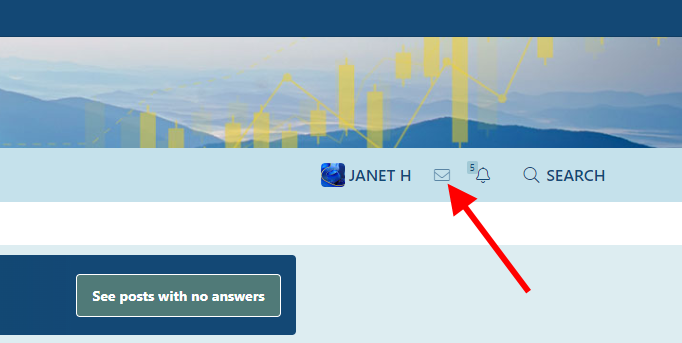
They were all retained. This software calls them "conversations" and you can find them under the envelope icon in the top rightDid Private Messages go somewhere? I don't see them.
 www.early-retirement.org
The Profile banner is a large, wide image. It only displays on your profile page, and you can upload or change the image as desired. Choose a large image at least 1000 pixels wide. You'll be able to crop the vertical display once the image is uploaded (slide it around). Small images will be stretched to fill the space and look pixelated.Tell us more about the profile banner image. Looking at Janet H's profile banner it appears to be a rectangular image that spans the entire width of the site. Is this correct? What is the optimal size?
They were all retained. This software calls them "conversations" and you can find them under the envelope icon in the top right
View attachment 50814
The latest posts, what's new and the all threads link each work a little differently. Most will only show you new content that you haven't yet read. The All Threads view doesn't take that into account. It's unaffected by your latest activityI actually prefer the Latest Posts page on my smartphone, no scrolling or realizing needed, just drag down to trigger an update...
What's new
There are a number of options here - read through them and make the sections that seem right.I took your advice and updated my avatar with a larger image, but I did have one question.
What does it mean when it says under "Privacy" in the "Your Account" section, that there is a choice of settings for "View Identities"?